Painting Reflections Comparison in Water, Glass, and Metal

Painting Reflections Comparison in Water, Glass, and Metal by Lorraine Watry

Reflections in water, glass and metal can be very interesting to paint. There are some similarities and differences between the three reflection subjects. In all three cases, it’s the reflections that can make the subject interesting. The reflections are used to help create the piece of glass or metal. Reflections in water can help give form, direction, and context.

Water Reflections

Stained Glass Waterlilies watercolor with Lorraine Watry

© Stained Glass Waterlilies by Lorraine Watry

  • Surface - Reflections in water are generally on a horizontal surface. As in the case of waves, there is movement in the water that can vary the surface to almost vertical.

  • Shapes – The reflections on the surface of the water can be almost “mirror-like” or they can be very abstract. The shapes are often somewhat horizontal lines, sometimes swirling shapes around objects, and some angles depending on the flow of the water and what is reflected.

  • Colors – The color of reflections can depend on what is reflected on the surface, such as a brightly colored boat or a swan. The sky will often be reflected on the water. Shadows on the water can make openings to see objects, like rocks or fish, below the surface. The color of the water will make a difference in the color of the reflections. The time of day and the atmospheric conditions can also have an effect on the color of the reflections.

  • Edges – You can have both hard and soft edges occur in water reflections.

Glass Reflections

Bottles and Bubble Wrap watercolor by Lorraine Watry

© Bottles and Bubble Wrap by Lorraine Watry

  • Surface - Glass reflections can be on a variety of surfaces and in a variety of forms. The type of glass used to make the object, such as cut crystal vs. smooth glass, can affect the reflections.

  • Shapes – The reflections on the surface of glass tend not to be “mirror-like” (unless it is a mirror or glass window). The reflections are usually distorted due to the shape of the glass and can often be very abstract.

  • Colors – There can be a huge variety of colors depending on what is being reflected, the lighting, and the color of the glass. Colored glass will change the color of the reflection and generally cause the reflection to be muted or it may cause a visual-mix of colors. You will often see grays, blues, and purples in clear glass or a variety of color depending on the objects around the piece. The thickness of the glass can also change the colors we see in the reflections.

  • Edges – You can have both hard and soft edges occur in water reflections.

Metal Reflections

Feathers and Brass Watercolor by Lorraine Watry

© Feathers and Brass by Lorraine Watry

  • Surface – Metal reflections are more like glass reflections because there are a variety of surfaces and shapes. The kind of metal (gold, silver, copper, brass) will make a difference on the look of the reflections.

  • Shapes – The reflections on the surface of metal can be both “mirror-like” and abstract or distorted depending on the form of the metal and how shiny it is.

  • Colors – The color of the reflections in metal are similar to both water and glass. The reflected colors are depend on the color of the metal object and how shiny it is. The color of the metal will often shift the colors reflected into it. Metal can show the blue of the sky if it is outside. There can be both strong and muted colors reflecting on metal. The lighting can make a difference on how bright or muted the reflected colors appear.

  • Edges – You can have both hard and soft edges occur in water reflections.

Think About Your Painting's Background

Flight of Fancy by Lorraine Watry

Your Painting’s Background
One would think the important part of the painting is your main subject and it is, but there are supporting actors in every scene that are also very important. Those supporting actors might include: the background, smaller shapes and/or negative space.

Why you should think about the painting’s background before you start.
You see an exciting subject: a bird, a piece of glass, a flower, and you can't wait to jump in and start the painting. Before starting your painting, do you take the time to work out where your main subject is going to reside in the space on your painting? Will this subject have a fully integrated background that gives depth, adds atmosphere and possibly tells more of the story, will it be silhouetted, or a mix of the two?

Imagine the Mona Lisa without the ethereal landscape behind her. Her story would lose some of its complexity. If it were just a black or single-color background, she might not hold our attention the same way. Now imagine a beautiful botanic flower illustration. If the flower was placed against a busy scene of other flowers or in some colorful setting, it might get lost and the scientific feeling of realism might be lost.

Here are three examples of paintings where I started with the background.
The time to think about the area surrounding your subject is before you begin the painting. Planning a watercolor can make a difference because you may already have the solution to possible problems.

Three of the steps for my watercolor - “Bamboo and Lilies”

Example 1: In this painting, Bamboo and Lilies (above), I started with the waterlilies and lily pads masked so that I could paint the detailed background reflections in the water. By masking these areas, I did not have to be careful to paint around them and I could focus on painting the wet-on-wet background.

Three of the steps for my watercolor - “Dueling Pintails”

Example 2: In “Dueling Pintails” (above), I started with the water again and masked the birds. By painting the water first, I get a large area of the white of the paper covered with paint and that helps judge the values of my main subjects. I don’t always finish the background before I start the main subject, though.

Three of the steps for my watercolor - “Rainbow Grizzly”

Example 3: In the final example, “Rainbow Grizzly” (above), the background and main subject were painted virtually at the same time. This painting was started with a single-pour background. Once the first layer was dry I used painted on top of that. My plan from the beginning was to allow some of that first layer or background color to show though some of the areas of the bear. So, starting with the background in this case guided me on what colors to paint the bear with.

How often do I paint the background first?
If you asked me what I paint first in the majority of my paintings I would say the background. However, the background doesn't have to come first as long as you have thought about your process and included the background in the planning. If you try to place your main subject in a background after-the-fact it will often feel out of place.

You've found a great subject. Now plan the background. Your background may already be a part of your reference.

  • Do the values and shapes in the background work?

  • Do you want to change the color or lighting, or the look of an element (sky, water, wallpaper, etc.)?

  • If you are going to paint the subject as a silhouette do the negative shapes (white of the paper) have variety?

  • Do you want to start in the background or work it into the painting as you go?

  • Lastly, if making major changes, paint a small color study to try out your changes prior to jumping into the painting.

To conclude, take the time to think about the background before jumping into the painting. I think you will thank yourself!

How To Scan Your Watercolor Painting

How I Scan My Paintings by Lorraine Watry

Instead of photographing my paintings to document my artwork, I scan them! By scanning my paintings I end up with images that are the same size as the paintings. This high quality image represents the colors of my paintings very accurately. Note - there are professional businesses that will scan your painting for a fee. If you are not very tech- oriented or you don’t want to take the time to do it yourself, the cost may be worth it.

My Equipment:

I use an Epson Perfection v500 flatbed scanner. The scanning area is 8.5”x11.7”. It is important to use a scanner that opens on the end rather than the side to be able to scan larger paintings. (image 1)

Image 1 - Epson Scanner

I use Affinity Photo Software - it is similar to Photoshop but Affinity is less expensive. Not only does Affinity stitch images together, you can crop, adjust the dpi, color adjust, export a variety of file types and much more. (image 2)

Image 2 - Photo Software

My Process:

Upon completing a painting, I sign it and then on the back I divide it into sections and mark the divisions with a line.

It is important that the sections of the painting will overlap by at least a 1/2” inch. The overlap is important for the “stitching” of the painting pieces back together. My division lines are at 7”, to leave room on either side of the scanner for overlap. (image 3)

Image 3

A full sheet painting usually takes about 10 pieces in order to get the whole thing scanned. A 1/2 sheet painting is about 6 pieces. Each painting has a folder on my computer with all the scanned pieces as individual files to make them easy to find when I use the Affinity software. (image 4)

Image 4 - Watercolor Paper over scanner surface

It is important to make sure the scanner surface is clean and free of particles to get a clean scan. I use an antistatic cloth on the surface prior to scanning. (image 5)

Image 5 - Antistatic cloth for cleaning scanner surface

Sometimes I will set some heavy books on top of the scanner to keep a larger painting from slipping while scanning.

Image 6 shows the scanner with a full sheet watercolor on the scanner and a green binder on top to weigh the scanner cover down. (image 6)

Image 6 - Heavy book on top of scanner to keep paper in place

Using the Affinity Photo Software to “stitch” the pieces back together:

Step 1: Go to ‘File’ and then select ‘New Panorama’. The New Panorama window will open.

Step 1 - New Panorama

Step 2: Select ‘Add’ on the bottom left. From your files, choose all of the scanned pieces to insert.

Step 2 - Add images

Step 3: Select ‘Stitch Panorama’ at the bottom. An image of your painting will appear in the blue box. If you notice it doesn’t look right, you may need to re-scan and make sure you have a 1/2” to 1” overlap. If the image looks good, select OK on the right.

Step 3 - Stitch Panorama

Step 4: You will see an enlarged image of your painting after selecting OK. If it looks good, select ‘Apply’ (blue box on the upper left).

Step 4 - Apply

Step 5: Now you can crop the image or make color corrections if something isn’t quite right. Remember, it needs to match your original painting if you are entering it in an exhibition.

Step 5 - Crop, make adjustments now

Step 6: After making any adjustments or cropping, the file can be exported. Select ‘File’ and ‘Export’. The file can be exported as a .jpeg or .tiff or many other file types. Most exhibitions will want a .jpeg file at the ‘best quality’ - 300dpi.

Step 6 - Export file as a .jpeg or other file type

Note: I save the file as the largest size and then use this file to make a copy and reduce the size depending on what the exhibition entry requires.

Time to Scan and Process:

Scanning a full sheet painting usually takes about 20 to 30 minutes depending on the speed of your scanner and computer. Once you understand the process for using the Affinity Software, stitching the pieces together usually takes less than 10 minutes. I have noticed the edges are sometimes slightly askew, but I just crop in a little and the rest of the image looks great.

Here are the pieces of a full sheet painting (with overlap) prior to stitching together.

The next image shows the final image of my painting after stitching together and saved as a 300dpi file.

Note: The full size files are very large and if you start scanning and stitching paintings, you may need a bigger hard drive to store the painting files.

I find the Epson Perfection v500 scanner to have really good color accuracy. I have only noticed an issue on one painting with turquoise that didn’t scan quite right, other than that I am very happy with the color. There are scanners with a larger scanning area. If you are looking for a scanner make sure you read the reviews for color accuracy and get one with the lid that opens on the end, not on the side.

YouTube is a good source to get more info on using the Affinity Photo Software.


Artists Beware of Instagram Paypal Phishing Scam

This is my story of how someone tried to gain access to my Paypal account through a “supposed” painting purchase on Instagram. In this day of online art promotion on Instagram and other sites, not only can we have positive experiences, but there can be negative ones as well. While I am excited when someone contacts me, from an online source, to purchase one of my watercolors I also try to do my due diligence and make sure I’m not being scammed.

I want to relay my experience through the actual back and forth messages that happened on Instagram to hopefully get the word out and protect other artists from possibly giving up their Paypal information to scammers.

The Instagram contact seemed alright at the beginning (Instagram Message 1). Accept now, looking back, I also received a couple other contacts on or near the same day that asked to buy a painting and only one actually listed the artwork they were interested in.

I will call her “X” because she signed a lot of her messages that way.

*Note: X’s account on Instagram looked legit, because I did look it up to see if someone was spoofing her account. OK, back to the story.

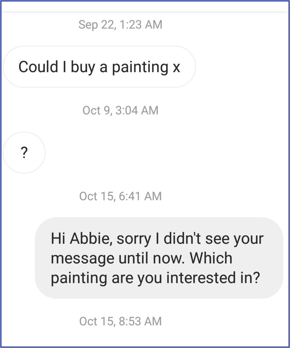
Next, X sent an image of a painting that I had just posted (Instagram Message 2). This was a tiny “yellow flag” because she had initially contacted me on September 22nd and I posted this one on October 15th. So, I thought, maybe she had seen this one and was more interested in it than the one she had initially seen.

*Be careful not to justify something that seems a little off.

At this point, I was not messaging with X in real time. I checked back the next day and let X know that the painting, “Bee, Butterfly, Baritone” was not for sale. I let X know I could set it up as a print, though.

That same morning, X commented back, as you can see in (Instagram Message 3), and asked about another painting.

*That started my “Spidey Senses” tingling because it would be unusual for someone to immediately jump to a different image and really a different style painting (Instagram Message 4). The first painting was more realistic and detailed and purely watercolor while the second was an ink and watercolor and a little more graphic in style.

So, while I had a niggling feeling, I continued with the conversation because at this point there were still no red flags.

X had asked about a post I made that day, “Red Wing Black Bird”. I let X know that the painting was available.

X said, “Ye that’s fine does that price include shipping x”. I am not sure if the “x” in her comments was supposed to be her signature or a “kiss”, but maybe that also threw me off because it felt a little friendly.

So far in the conversation there was no, “I really like your art” or “This piece really speaks to me”. It felt very transactional with no wanting to get to “know the artist” comments. I find that most of my collectors like to know more about me or the piece before they make a purchase.

I told X that the price did not include shipping and that I would need her address to be able to price the shipping. X gave me her address, which I looked up. It showed up as a house in England.

X then asked, “How much would shipping be x”.

I let X know that I would find out the shipping on Monday and let her know. Here is one of the frustrating parts of this interaction (but a learning moment), I took the time to create a box, with all of the bubblewrap and foam to protect the matted painting. Then I went to a local shipping company and got the price to ship the painting to X. This took time away from something else I could have been doing, like painting.

*Next time: I am contacted about a painting, I will do some measurements and guess at the weight to use an online shipping calculator. I can then give the customer an estimate to see if they want to go forward.

October 19th - I let X know the shipping costs.

October 20th - X said, “Ye that’s fine I can pay that x”

Then X said, (que the dramatic music - Dun, Dun, Dun!) …

“So how much would it be in total and do you accept pay pal x” *This is now a Yellow Flag (#1) to me because of this transaction.

I told X I would create a Paypal link and send it to her and that I would need her email address (Instagram Message 5). X sent her (supposed) email.

*Note: I know Paypal is set up to allow someone to send you money by just using your email. However, for art purchases, I like to create a button and send the link. That way, the customer and I will have an invoice of the purchase and I can make sure the amount sent is the correct amount.

Yellow Flag #2 - A few hours after I sent the email with the Paypal link, X messaged that she had not received the link (Instagram Message 6). I used the email X sent me. But, I figured that maybe it went to her spam folder because I used my business email (me justifying things).

So, I suggested that X look in her spam folder. I also copied the link and attached it to the message. X could have used the link directly from my response.

But…a couple of days later, X responded that she was “not in” Not at home, not in the country, not in her right mind?! Sorry, I just had to get a dig in to my unseen foe.

Yellow Flag #3 - X said, “…can I just pay through your email x”

OK, so "Spidey Sense” is tingling again, but I have received payments for classes and other things by someone sending it directly to my email.

Thus, I gave X the same business email that I noted in an earlier comment.

X commented a few hours later, “Perfect will I pay now x”. Instead of “I will pay now”. I was wondering about that when X further commented…

“Are you ready for me to pay x” - BIG Yellow Flag (#4) (Instagram Message 8)

Why would X ask if I am ready for her to Pay? When someone pays me through my email on Paypal, I don’t need to do anything. The customer makes the payment using my email and the money goes into my account.

The next comment X made got all the “Spidey Senses” tingling and the RED ALERTS going off!

X sent, “Did you get a confirmation code from pay pal x”

*Maybe ten minutes before X asked this, my phone sent me a text message with a confirmation code for Paypal. I thought that was very odd because I had not asked for a verification code. I did look this up and saw on Paypal that sometimes a code can go to the wrong phone because someone has entered the wrong number.

I have two step verification set up on my Paypal account. If you don’t, I would highly recommend that you do this.

The next message from X was the screen shot seen in the last image (Instagram Message 9).

It showed a message from Paypal asking for a verification code.

X said, “Let me know if you get the code x” RED FLAG, RED ALERT, ALL THE BELLS AND WHISTLES GOING OFF!!!

I have heard enough scamming stories to know that you should never give a verification code for Paypal to anyone!

X was trying to get into my Paypal account. If I had given X the verification code I had received about 10 minutes earlier, she may have taken over my Paypal account! Because my “Spidey Senses” had tingled, I transferred the funds I had sitting in my Paypal account earlier that morning, so I don’t think X could have gotten anything, but I don’t know for sure.

Moral of the Story - If something about a transaction feels off, it just may be. Do your due diligence and check out what you can. Never ever give a verification code to anyone!

Instagram Message 1

Instagram Message 1

Instagram Message 2

Instagram Message 2

Instagram Message 3

Instagram Message 3

Instagram Message 4

Instagram Message 4

Instagram Message 5

Instagram Message 5

Instagram Message 6

Instagram Message 6

Instagram Message 7

Instagram Message 7

Instagram Message 8

Instagram Message 8

Instagram Message 9

Instagram Message 9

Basic Supply List for Watercolor

I thought it might be helpful to post my Basic Watercolor Supply List. The items on this list are things I like my students to have. Different instructors might suggest other items or quantities. As I say at the top of the list, I feel it is important to buy professional or artists grade paper and paint because the student quality can really cause issues with learning and using watercolor.

If you need to purchase items slowly, then I would get one piece of 100% cotton watercolor paper from Arches or Fabriano. There are other professional brands, but these are readily found. You can cut it up into smaller pieces and use both the front and back.

Also, if you can only get a few tubes of paint to start, I would purchase Ultramarine Blue, Quinacridone (Quin.) Rose, Hansa Yellow Light, and add Burnt Sienna when you can. These four tubes of paint will give you a wide variety of colors by mixing them.

I hope this watercolor supply list is helpful.

1 New Basic Supply List - for website blog post.jpg

The Colors on My Watercolor Palette

I have questions about the colors that are on my watercolor palette every now and then. So, I thought I would do a post showing my palette layout and the watercolors I currently have on my palette.

A Note About my Palette:

This palette of colors works well for the kind of paintings that I like to do. However, they may not be the colors that you or many other watercolorists would want on their palettes. Any time a teacher suggests or requires colors for a painting or class, it is a good idea to decide if you really need to add them to your palette. You may try their suggestions and find a new color that you really like or you may spend a lot of money going from one set of colors to the next. At some point it is a good idea to limit the colors you are working with and really investigate the mixes and techniques that you can do with those colors.

Starting with a Limited Palette:

Just because I have all of these colors on my palette now, does not mean that I started watercolor using this many pigments. If you are just starting out, one of the best things you can do for yourself is to start with a limited palette and really learn what those colors can do and how they mix together. A suggestion for a 4 color limited palette might be - Cobalt, Quinacridone Rose, and Hansa Yellow Light (or Lemon Yellow), and Burnt Sienna. If you want to expand a little more, I would suggest a 7 color limited palette that has a ‘warm’ and ‘cool’ version in each color family, plus brown. This 7 color palette would be - Ultramarine Blue (cool) & Phthalo Blue (warm), Quinacridone Rose (cool) & Pyrrol Scarlet (warm), Hansa Yellow Light (cool) & New Gamboge (warm), and Burnt Sienna. With these 7 colors you can make a huge variety of mixes including secondaries, grays, browns, and blacks.

The Kind of Palette That I Use:

I use a Stephen Quiller Palette. It is 15”x15” and comes with a lid. They also have a porcelain palette, but it is heavier and more expensive. The other difference is the porcelain palette has a few less paint wells than the plastic palette. Over time my plastic palettes do crack and I will replace them periodically.

Here is the current layout of my Watercolor Palette as of January 2022:

How I Layout My Palette:

Stephen Quiller has a method to layout this palette with specific colors that he uses in his paintings and that work well for making mixes. I, however being the rebel I am, don’t use the palette with Mr. Quiller’s setup or pigment choices.

I like this palette because of the large center mixing area and the number of wells (32) available for my paint. You may notice that there are more than 32 wells on the image above. I decided after using the palette for a while, that I could divide the corner wells by using some hotglue to create dividers. The lower left (red corner) shows the wells without the hotglue added. The other three show the extra wells I made to add 6 more wells. I drew a line with the hotglue, let it dry, and then added the next line of hotglue until I had the divider tall enough.

My palette colors have changed over time. I tend to keep using the same colors for a year or two. If I haven’t used a color in that time, then I might change it out for something new. My palette slowly morphed into this layout with a few recent changes.

I lay out my palette with a color wheel in mind. The colors are in their color families - blues, greens, yellows, oranges, reds, etc. The longest pointed well at the top contains Cobalt blue. It is the color I use as my Primary blue. Others consider Ultramarine or Phthalo Blue as the primary blue. In the longest pointed Yellow well, I have Hansa Yellow Light as my Primary Yellow (in place of Lemon Yellow), and Quinacridone Rose in the Primary well for the reds.

Then I lay out the other colors between them. ‘Warmer’ reds are on the right side of Quinacridone Rose toward the oranges and the ‘cooler’ reds are on the left side of Quinacridone Rose toward the purples. I continue this process for the other color families. There are a few oddball colors in the corners, like some browns and dark colors like Indigo and Sodalite Genuine.

The Pigments I use:

Most of the pigments I have on my palette now are from Daniel Smith. I also have a few pigments from Holbein. I used to use a variety of brands, but over time slowly changed to Daniel Smith because I like how easily their paints re-wet after drying, how full of pigment they are, and the large variety of colors. The Holbein colors I have on my palette are ones that Daniel Smith doesn’t have or that I like better in the Holbein brand for various reasons.

I have noted under each of the pigment names what brand they are with a D.S. for Daniel Smith and an H. for Holbein.

The other aspect of the pigments on my palette is that they are transparent to semi-transparent. I don’t like to use opaque pigments because I like the transparency and glow of the paper through the paint.

Use This or Other Palette Layouts as a Jumping off Point:

I have created a YouTube video that goes over the layout of my palette, why I chose certain colors, and some of my favorite mixes. Here is the link for that YouTube video - Tip #17 My Watercolor Choices and Mixes.

I know some watercolor teachers that don’t share the colors they are using. They may not want to give away how they make their mixes or they want the students to investigate and learn what the pigments do without influence from the teacher.

I see sharing my colors as a jumping off point for students and I don’t mind sharing the colors that I like to use. I hope that the students will explore other pigments and find the colors and mixes that work best for them.