Basic Supply List for Watercolor

I thought it might be helpful to post my Basic Watercolor Supply List. The items on this list are things I like my students to have. Different instructors might suggest other items or quantities. As I say at the top of the list, I feel it is important to buy professional or artists grade paper and paint because the student quality can really cause issues with learning and using watercolor.

If you need to purchase items slowly, then I would get one piece of 100% cotton watercolor paper from Arches or Fabriano. There are other professional brands, but these are readily found. You can cut it up into smaller pieces and use both the front and back.

Also, if you can only get a few tubes of paint to start, I would purchase Ultramarine Blue, Quinacridone (Quin.) Rose, Hansa Yellow Light, and add Burnt Sienna when you can. These four tubes of paint will give you a wide variety of colors by mixing them.

I hope this watercolor supply list is helpful.

1 New Basic Supply List - for website blog post.jpg

The Colors on My Watercolor Palette

I have questions about the colors that are on my watercolor palette every now and then. So, I thought I would do a post showing my palette layout and the watercolors I currently have on my palette.

A Note About my Palette:

This palette of colors works well for the kind of paintings that I like to do. However, they may not be the colors that you or many other watercolorists would want on their palettes. Any time a teacher suggests or requires colors for a painting or class, it is a good idea to decide if you really need to add them to your palette. You may try their suggestions and find a new color that you really like or you may spend a lot of money going from one set of colors to the next. At some point it is a good idea to limit the colors you are working with and really investigate the mixes and techniques that you can do with those colors.

Starting with a Limited Palette:

Just because I have all of these colors on my palette now, does not mean that I started watercolor using this many pigments. If you are just starting out, one of the best things you can do for yourself is to start with a limited palette and really learn what those colors can do and how they mix together. A suggestion for a 4 color limited palette might be - Cobalt, Quinacridone Rose, and Hansa Yellow Light (or Lemon Yellow), and Burnt Sienna. If you want to expand a little more, I would suggest a 7 color limited palette that has a ‘warm’ and ‘cool’ version in each color family, plus brown. This 7 color palette would be - Ultramarine Blue (cool) & Phthalo Blue (warm), Quinacridone Rose (cool) & Pyrrol Scarlet (warm), Hansa Yellow Light (cool) & New Gamboge (warm), and Burnt Sienna. With these 7 colors you can make a huge variety of mixes including secondaries, grays, browns, and blacks.

The Kind of Palette That I Use:

I use a Stephen Quiller Palette. It is 15”x15” and comes with a lid. They also have a porcelain palette, but it is heavier and more expensive. The other difference is the porcelain palette has a few less paint wells than the plastic palette. Over time my plastic palettes do crack and I will replace them periodically.

Here is the current layout of my Watercolor Palette as of January 2022:

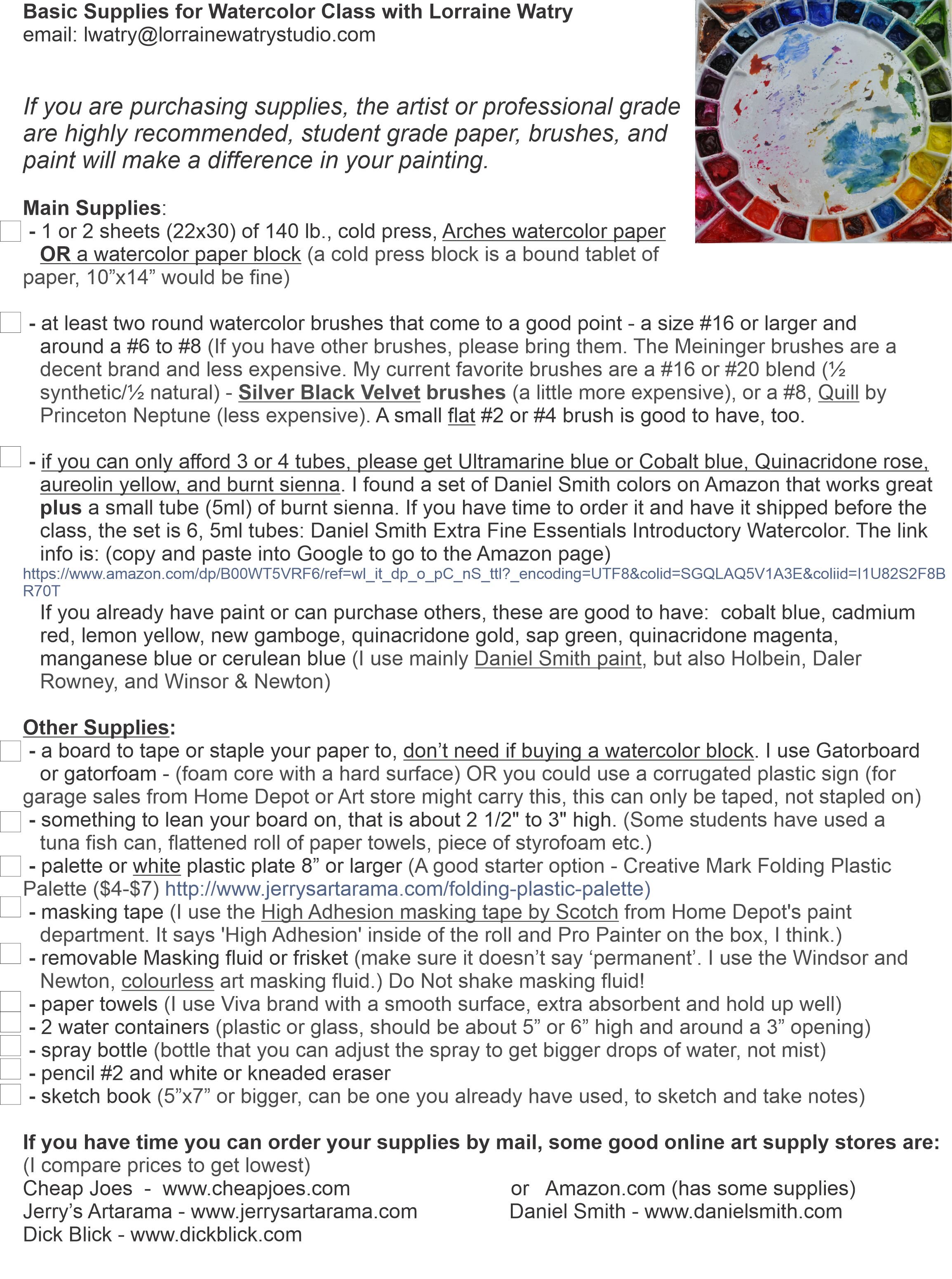
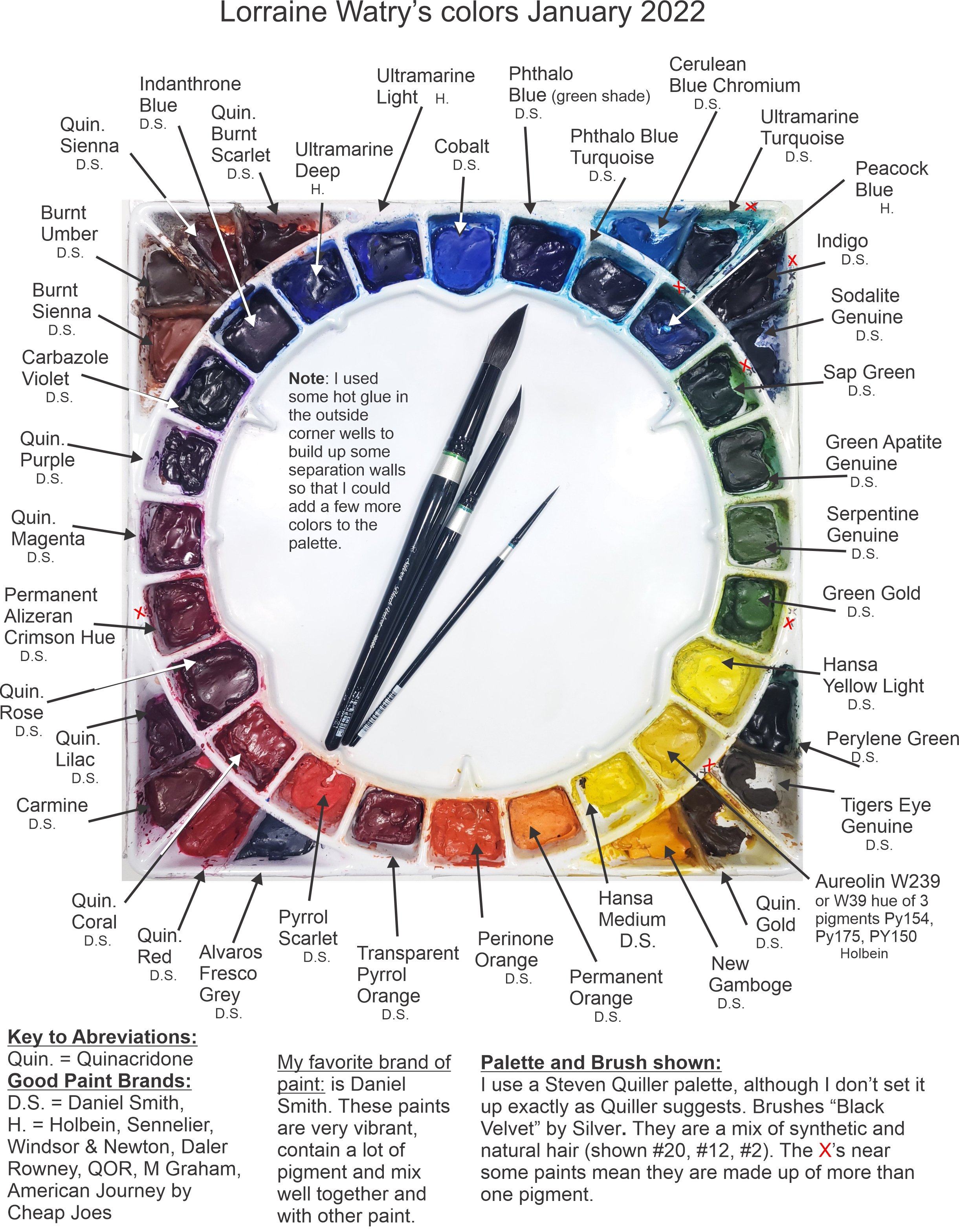
How I Layout My Palette:

Stephen Quiller has a method to layout this palette with specific colors that he uses in his paintings and that work well for making mixes. I, however being the rebel I am, don’t use the palette with Mr. Quiller’s setup or pigment choices.

I like this palette because of the large center mixing area and the number of wells (32) available for my paint. You may notice that there are more than 32 wells on the image above. I decided after using the palette for a while, that I could divide the corner wells by using some hotglue to create dividers. The lower left (red corner) shows the wells without the hotglue added. The other three show the extra wells I made to add 6 more wells. I drew a line with the hotglue, let it dry, and then added the next line of hotglue until I had the divider tall enough.

My palette colors have changed over time. I tend to keep using the same colors for a year or two. If I haven’t used a color in that time, then I might change it out for something new. My palette slowly morphed into this layout with a few recent changes.

I lay out my palette with a color wheel in mind. The colors are in their color families - blues, greens, yellows, oranges, reds, etc. The longest pointed well at the top contains Cobalt blue. It is the color I use as my Primary blue. Others consider Ultramarine or Phthalo Blue as the primary blue. In the longest pointed Yellow well, I have Hansa Yellow Light as my Primary Yellow (in place of Lemon Yellow), and Quinacridone Rose in the Primary well for the reds.

Then I lay out the other colors between them. ‘Warmer’ reds are on the right side of Quinacridone Rose toward the oranges and the ‘cooler’ reds are on the left side of Quinacridone Rose toward the purples. I continue this process for the other color families. There are a few oddball colors in the corners, like some browns and dark colors like Indigo and Sodalite Genuine.

The Pigments I use:

Most of the pigments I have on my palette now are from Daniel Smith. I also have a few pigments from Holbein. I used to use a variety of brands, but over time slowly changed to Daniel Smith because I like how easily their paints re-wet after drying, how full of pigment they are, and the large variety of colors. The Holbein colors I have on my palette are ones that Daniel Smith doesn’t have or that I like better in the Holbein brand for various reasons.

I have noted under each of the pigment names what brand they are with a D.S. for Daniel Smith and an H. for Holbein.

The other aspect of the pigments on my palette is that they are transparent to semi-transparent. I don’t like to use opaque pigments because I like the transparency and glow of the paper through the paint.

Use This or Other Palette Layouts as a Jumping off Point:

I have created a YouTube video that goes over the layout of my palette, why I chose certain colors, and some of my favorite mixes. Here is the link for that YouTube video - Tip #17 My Watercolor Choices and Mixes.

I know some watercolor teachers that don’t share the colors they are using. They may not want to give away how they make their mixes or they want the students to investigate and learn what the pigments do without influence from the teacher.

I see sharing my colors as a jumping off point for students and I don’t mind sharing the colors that I like to use. I hope that the students will explore other pigments and find the colors and mixes that work best for them.

Watercolor Techniques For Creating Children's Book Illustrations by Lorraine Watry

I’ve started to get a system for producing the watercolor paintings for the children’s book, “For I Am Yours” by author Pauline Hawkins. I have all the drawings for the 17 illustrations ready. As I start to finish up a painting that I am working on, I will use my light table and transfer a few more drawings to my watercolor paper. I work on Arches, 140 lb. cold press, watercolor paper. After I have transferred the drawing to the watercolor paper, I stretch my paper onto gator foam boards. You can see my Youtube video about the process at this link: How to Stretch Watercolor Paper and Transfer a Drawing.

Creating A Value Sketch For A Watercolor

In the image above, I have transferred the drawing, stretched my paper, and begun the painting. I also scanned my drawings and made small copies of them to create a value sketch (seen at the top of this image). These value sketches will help remind me where my light is coming from for the watercolor illustrations. I am working with minimal photo resources and making up most of the scene. So, I have to chose the direction of my light source and taking the time to create the value studies is important to help get the light and the composition right.

Adding Layers To A Watercolor

I started these two pages by painting the first layers of color on sections of the painting. At this stage, I am working with the lightest value of the color in each of the shapes. In a few areas of the illustration at the right, I have started to add some shading. I use water on the edges of these shadows to soften them into the lighter area because the light on the subject is indirect light from a window or room light.

The second image shows the baby taking the blanket outside with her. I started this painting by wetting the grass background and then applying color. I wanted there to be a variety of greens in the grass. After the grass dried, I added the leaves of the tree branches by spritzing some water in that area and then painting random leaf shapes over and around the water drops. Some areas will have soft edges due to the water. Then I added the first layers on the sandbox, blanket, her skin and pants.

Now that I have a basic idea of how the colors and composition are working, I can begin to add more layers. The next steps show this process.

Focusing On One Illustration

After I have the beginning stages on both of the illustrations, I usually get interested in one of them and start working on it solely. In this case, The baby pulling the blanket outside, caught my attention. I knew what colors I wanted to use in this illustration. I used a paint called Tiger’s Eye Genuine for the sandbox because it is very granular and would automatically give me the look of sand. I mixed it with some ultramarine blue in a few places for the shadows. I believe the leaves on the tree were done with mixes of Sap Green and Ultramarine blue, some Green Apatite Genuine, or some Serpentine Green.

I added the shadows last over the top of the other colors. Whenever I create shadows in watercolor, I lay them over the base color, like the grass, the stepping stones, or the blanket. I want the base color to effect the look of the shadow. I also don’t want my shadows too dark or they can look like black holes. In this case I used Ultramarine Blue and Pyrrol Scarlet (a warm red) to create a neutral or muted purple shadow color.

Deciding on a Color

When I went back to the first painting, where the baby is reaching out for the blanket, I had a hard time deciding what color I wanted mom’s clothes to be. I could have done a small color study beforehand or in this case I used some clear acetate that works with wet media like watercolor to get an idea of my colors. In the image at the right, I have laid the acetate over the painting and then painted with my watercolor right on top of the acetate to get an idea of the color I might use. (Sorry about the bright highlights. Those are my desk lights reflecting in the acetate.) I chose to go with the gray tones in mom’s outfit because there were a lot of bright colors in the rest of the scene. I felt there needed to be some neutral colors to counter balance the bright colors.

Finishing the Illustrations

I kept adding layers to both illustrations. When I didn’t know where to go with one or I was waiting for the paint to dry, I would work on the other one. I added more glazes to both to deepen the colors. I used the same color or a mix to add depth. I also added some more shadows to the outside scene and used a little Indigo on the inside scene to shadow the corners. Shading the corners helps keep the viewers eye focused on the center of the illustration.

These were now complete enough to move onto the next illustrations. I will often leave the recently completed paintings on my board for a few days to make sure I don’t see anything else that needs adjusting. I will be continuing to blog about this process if you would like to follow along.

Children's Book Watercolor Illustrations - The Process By Lorraine Watry

Blankie Meets Baby

I am behind on my blog but I have a lot more of the illustrations for the children’s book, “For I Am Yours”, completed. For those that are new to my blog, I am creating 17 watercolor illustrations for a children’s book written by author, Pauline Hawkins. Some of these 17 illustrations are 9”x7” and some are the double spread and therefore, 9”x14”. The story is told from the blanket’s point of view and, as the baby grows, the blanket is needed less and less. The blanket is a metaphor for a mother’s love.

One of my favorite images so far is early on in the story when Blankie meets Baby for the first time and feels her breath on it’s ruffles. I enjoyed the close up view of the baby and tried to create a peaceful color scheme.

Skin Tones In A Watercolor

I started this watercolor with thin washes of color on the blanket, the babies skin, and the clothing. Then I started building the depth with glazes of the same colors. I use a warm red (Pyrrol Scarlet) with New Gamboge Yellow for the base skin tone on the baby and then start to glaze on more of the same colors for depth. I also use other mixes to cool the skin tone down in places or give it shadow. Some of the mixes I like are: Quinacridone Rose by itself or with a yellow like New Gamboge or Aureolin Yellow, Permanent Alizeran Crimson & Ultramarine blue for the shadows and Pyrrol Scarlet with a tough of Burnt Sienna for warm, darker areas. I also leave some glazes with hard edges and use water to soften other edges after applying them. If there were more dramatic light on the baby, my glazes would be darker and might have harder edges in places.

Applying Masking Tape To Preserve Whites In a Watercolor

Before starting the painting, I used some masking tape on the shapes that would become the baby’s breath. The tape was applied over my pencil line and then cut out. You can see more of this process in my blog post at this link: Masking a Watercolor With Masking Tape. You can see the masking tape in this image because of the darker paint. In this image I have continued to work around the painting. I applied the first layer of color to the hair and used some water toward the upper right corner to soften the hair into that corner. I also used some Indigo while the paint of the hair was still wet to darken the corner. I have started to add shadows. These additions allow me to see how all of the values and colors are working without over committing too soon. So, I take my time and keep building until I feel I have an area completed.

Painting An Illustration Without A Photographic Resource

I was not working from a photo for this image, as is the case for most of the illustrations in this children’s book. Therefore, I am using my knowledge of other paintings to create the light and form of the objects. I purposely kept the light on the babies face a little softer and used harder shadows on the blanket and the fabrics to keep the look of the baby soft and sweet. Whenever, I work on a face, I tend to make adjustments and changes as I go. With watercolor this can be a little tricky. I was happy with this painting, but in one of the later figures, I ended up having to start again because I could not get the facial features to work. To finish this illustration, I removed the masking tape from the shapes representing the babies breath. I then used a small flat brush with a little water to soften some of the edges of the white shapes, so that they would not stand out as much and look more “atmospheric”.

If you would like to see more of these illustrations, please follow along and I will continue to blog about this journey.

'For I Am Yours' Children's Book Illustrations in Watercolor by Lorraine Watry

This is the continuation of my posts to create 17 watercolor illustrations for the children’s book, “For I Am Yours” by Pauline Hawkins. My plan was to post about the process every Friday, but life got in the way! I have until the end of July to complete all 17 illustrations, so I have planned to get one or more done each week. Right now, I am ahead, but some of the coming illustrations will have more figures in them and I am anticipating these to take longer.

The images that I have completed are not in order. I have skipped around to the ones that I felt either wouldn’t take too long or that I felt the drawing was resolved and ready to go. The first two pages also helped me figure out the colors for almost everything because they will be repeated throughout the pages.

Here are the first two pages with the blanket waiting for the baby to arrive. Before applying paint, I masked some of the shapes with Winsor and Newton masking fluid. The shiny shapes in photo #1 is the masked areas. The masking will protect the white paper until I am ready to paint in those areas or I can leave them white.

Then I started painting the background walls. I used a mix of Aureolin (Cobalt) Yellow with Amazonite Genuine (a turquoise blue) and created a soft yellow green. Because I am making up these scenes, I am building them slowly so that I don’t go too dark. I found it easiest to paint in the objects that I was certain of their color and value and then move on to the objects with more value or color variations.

As I add objects, I keep adjusting the things around the room because I can better judge the value of everything. I ended up needing to increase the value of the walls and I gave them some shadows in the corners to make them less important and bring the focus to the middle of the image. In the final image, I have everything painted in and I have added shadows. .

As I was working on these pages, I took a break in the beginning and started adding some color to the second double page spread. It helped to get away from the first image to see it with fresh eyes and while one area dried on the first image, I often added the glazes to the second image.

Here are some images from the next pages:

Again, I started by painting in the color on the bedroom walls and the color on the blanket. In this scene the blanket has a little more character and is dreaming of the day the baby comes home.

I used some Winsor Newton and some Pebeo (blue) masking fluid to save some of the smaller parts of this illustration.

I then started painting the image of the baby in the ‘dream bubble’. I used a mix of a warm red (Pyrrol Scarlet) and yellow (New Gamboge), thinned with water to paint the base color on the skin and slowly added layers of color to form the face of the infant. I used lighter color and soft edges along the outside of the bubble to make it feel like a dream.

After looking at the scene some more, I decided to increase the size of the circles that lead to the thought bubble. Using some masking tape over the area, I cut out the larger shapes. I used a small piece of a ‘Mr. Clean Magic Eraser’ to scrub off the color and get those areas back to the white of the paper. If you use a ‘Mr. Clean’ make sure to use the kind that does not have soaps or chemicals because you don’t want to transfer these to the watercolor paper. Also, test your paper. The ‘Mr. Clean’ is abrasive and can tear some papers.

The final image here still has some areas that need adjusting or painting. I also decided to add the lamp in the lower right corner. I was able to use the same method listed above with the tape and ‘Mr. Clean’ to lift the paint and get back to the white surface of the paper.

I was pleased with the outcome of the first two, double page spreads, for the children’s book. I have already started work on several others and will continue to post more as I create them. Thanks for following along!