There is a lot to color theory and it can’t all be covered simply or quickly. This post is to give you some generalities to work with when making watercolor mixes and how to mix Vibrant Colors and not Muddy Colors.
When trying to make “Vibrant” color mixes try these tips:
1. The brand and quality of paint you use can and does make a difference on how vibrant your color looks. If you use a student grade paint, it will have chalky fillers in it to make it less expensive. The paint will not be as vibrant. Some brands of professional or artist grade paints are not as vibrant as others. It can depend on how much pigment they use in the mix and what kind of binder they use. I have switched to Daniel Smith Watercolor for almost every color on my palette because of how vibrant their colors are and how easy it is to re-wet the paint and load up my brush. (Paints that have the following labels are student grade: Cotman, Van Gogh, Academy, Akademie, Prang, Reeves)
2. Mixing too many colors together can lead to a dull or “muddy” color. Generally a mix of 3 pigments is safe, but when you make a mix of 4 or more pigments it brings in too many different color factors that can cause the mix to look muddy.
3. Using colors that only have one pigment in the paint instead of 2 or 3 can help you achieve brighter or more vibrant color mixes. An example - Cobalt is made of one pigment - PB 28*, while Permanent Alizeran Crimson Hue has 3 pigments - PR 177, PV19, PR 149 (*see note below for info on pigments). So, if I make a mix with Cobalt and Perm. Alizeran Crimson, I am actually mixing 4 different pigments, not just 2. Then if I decide to add another color to the mix, I now have at least 5 pigments involved. (*Pigments are designated with letters and numbers. The ‘P’ is always used to indicate pigment, then the other letters indicate the family the pigment comes from. So, ‘R’ is red, “B” is blue, ‘Y’ is yellow, ‘V’ is violet, ‘O’ is orange, ‘G’ is green, ‘Br’ is brown, ‘W’ is white, and ‘Bk’ is black. The official definition of the number part of the name is - generic index number that identifies it chemically, regardless of proprietary and historic names.)
Some brands of watercolor will have the pigments in each paint listed on the tube or on a color chart for that brand. (I only have a few paints on my palette now that have more than one pigment in them.)
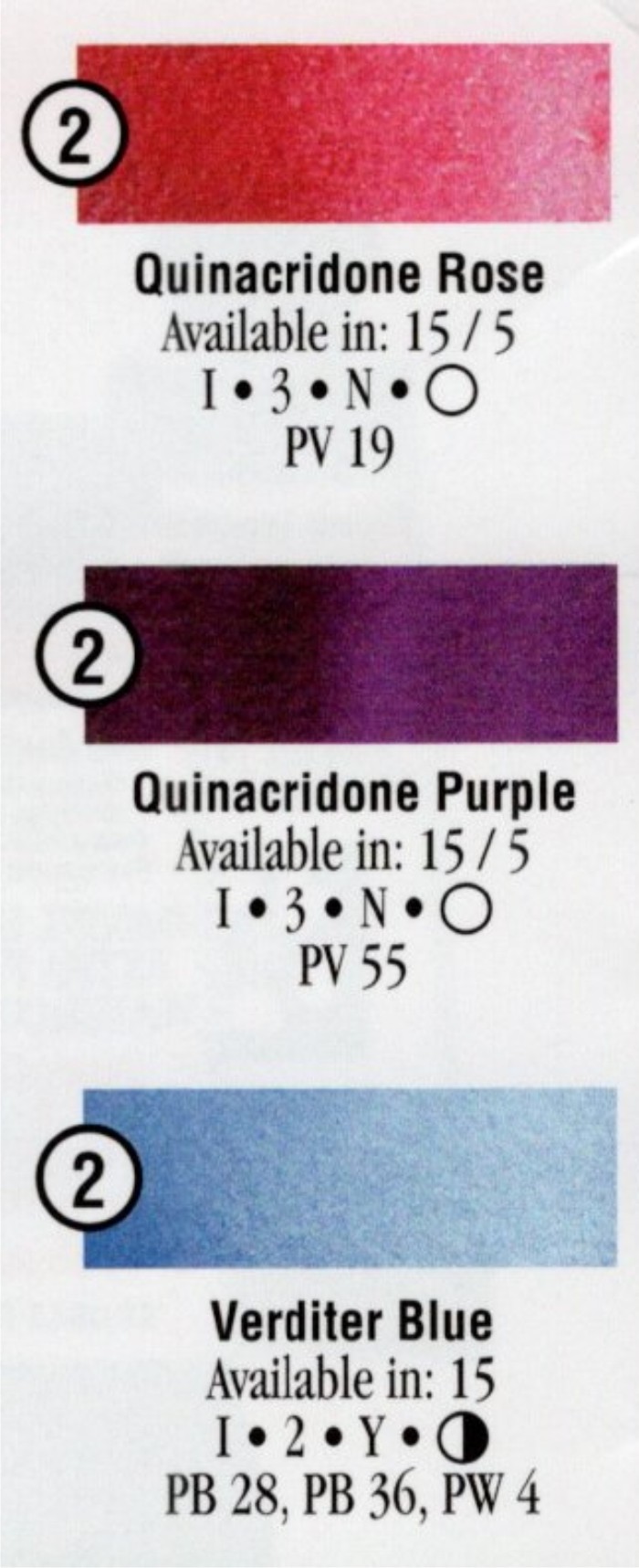
There are other properties like staining vs non-staining, granular vs non-granular, etc. for each pigment. The color charts usually have a key that tells you how to read the information. These properties don’t necessarily affect how vibrant a pigment or mix will be, but it is good information to know.
Example color chart info from Daniel Smith. (you can find some color charts online by Googling “paint brand and watercolor chart):
4. When you are brushing the paint onto your paper, the less brushing back and forth you do, the better. When applying the paint, I try to skim it across the surface and leave it. Brushing back and forth a lot in an area can cause the paint to be duller. Also, it can mar the surface of the paper, causing it to look dull. If you want to add color, or adjust an area, it is usually better to let it dry and come back later with another layer.
5. To darken a color and keep it vibrant, start by using a color in the same color family. For instance to darken a green add a darker green to the 1st paint. If that is still not dark enough then use a paint from a family that is next to green - which would be blue.
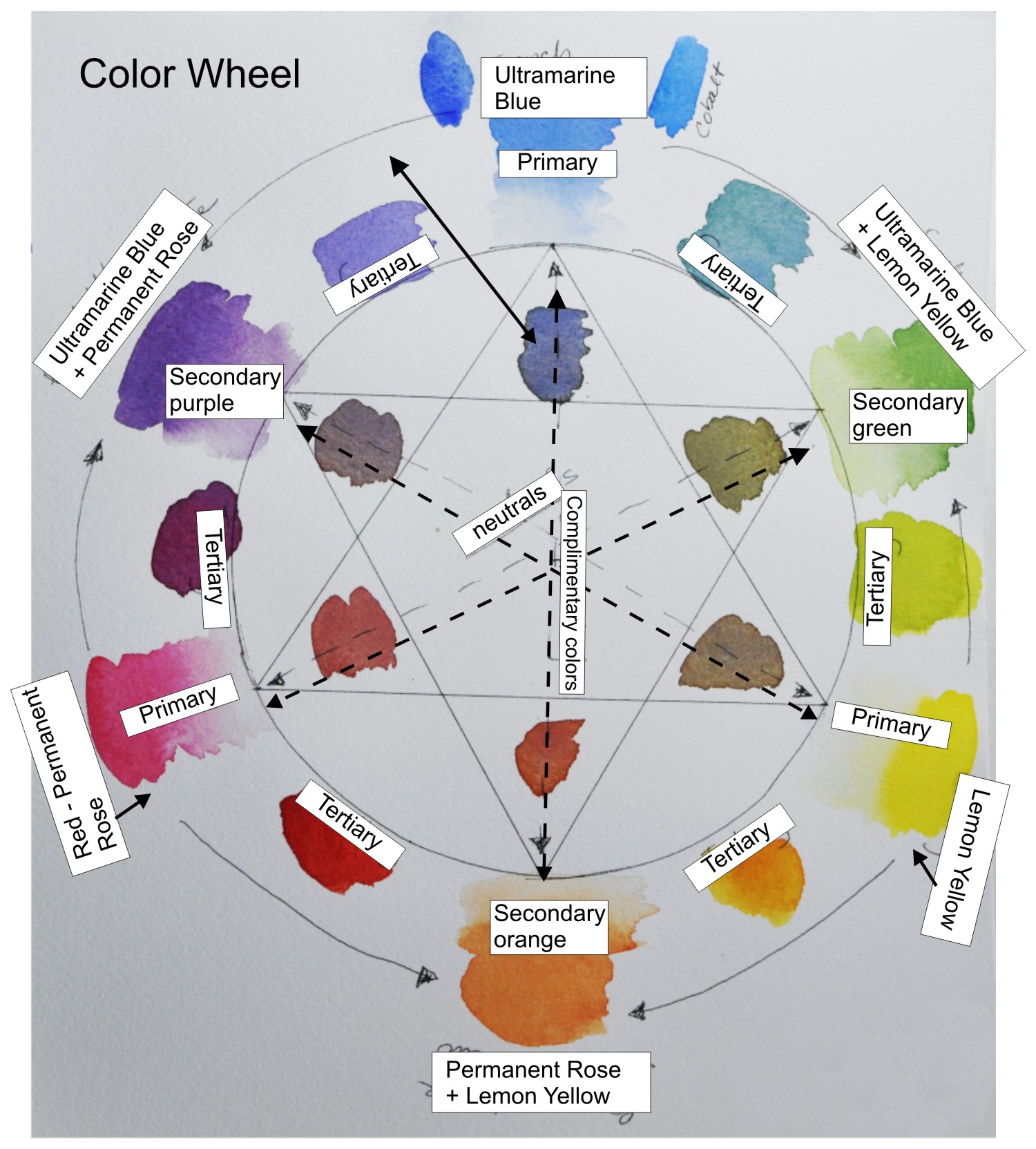
Example Color Wheel. There are many other options to create a color wheel.
6. When mixing colors - always think of the color wheel. The primaries are yellow, red, & blue. The secondaries are orange, green, & purple. Tertiary colors are mixes made from a primary color and a secondary color. When you mix colors across the color wheel you are mixing complimentary colors and these mixes will be more neutral or ‘grayed down’. Complimentary colors are: blue and orange, green and red, and yellow and purple.
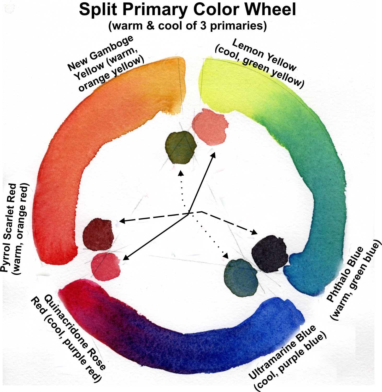
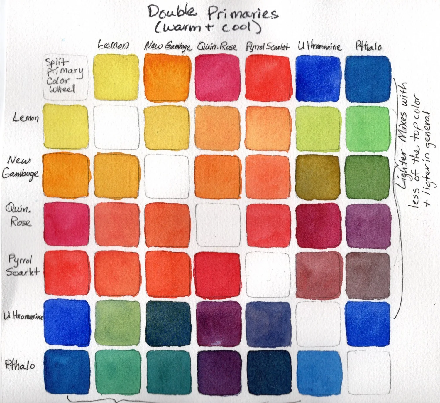
7. Color families are red, yellow, blue, green, orange, and purple. Each of these color families have colors that are cooler and warmer. Ex. in the red color family, Quinacridone Rose is a cooler red than Cadmium Red. So, if I mix a warmer red (leans toward orange) with a blue, the resulting purple mix will not be as vibrant because the warm red and blue are almost complimentary colors. Mixing two primaries that lean toward the same secondary will more likely create a vibrant mix. Ex. Lemon Yellow & Phthalo blue both lean toward green.
When trying to make a vibrant mix think about the above factors. If the color you get from the mix does not look very bright or vibrant, then you may need to investigate and make an adjustment in the pigments you are using to make the mix.
Hint: taking the time to make a color chart of the colors you are thinking of using in a painting can help you understand what kind of mixes you will get - Vibrant or Neutral.
For more Color Theory information check out this post “Understanding Color Theory” - Design Wizard


