Creating Illustrations for a Children's Book

In 2015 I was asked by author, Pauline Hawkins, to create the illustrations for a children's book that she wrote when her daughter was little. We started the process and then both our lives got busy and now we're getting back to it. I will be creating 17 watercolor illustrations to tell the story from the blankets point of view. The blanket is a metaphor representing the love of mothers for their children. As the child grows she needs her blanket less and less, but the blanket will always be there for her, protecting and loving her.

I have not created illustrations for a children’s book before, so I am learning as I go. I started with small mock-ups, about 2 1/2” x 3 1/2”, to sketch the story out. Pauline has modified the story a few times now, so a few of the images have changed or were deleted. Since I will be painting the illustrations with watercolor, I wanted to make sure the drawings are exact before starting the paintings. Watercolor is not an easy medium to make changes to. Changes are possible, but if I can avoid having to make adjustments, that would be preferred.

I asked Pauline for images of her daughter when she was little and the little girl is a combination of her daughter and some images of my daughter. I also looked up poses to use for some of the illustrations since I didn’t have photos of the actual scenes. The stuffed animals that inhabit the little girls room are from Pauline’s two kids and my three kids. I enjoyed placing them around the scenes as secondary characters. I also decided to include a butterfly in almost every scene for the young readers to search for when reading the book.

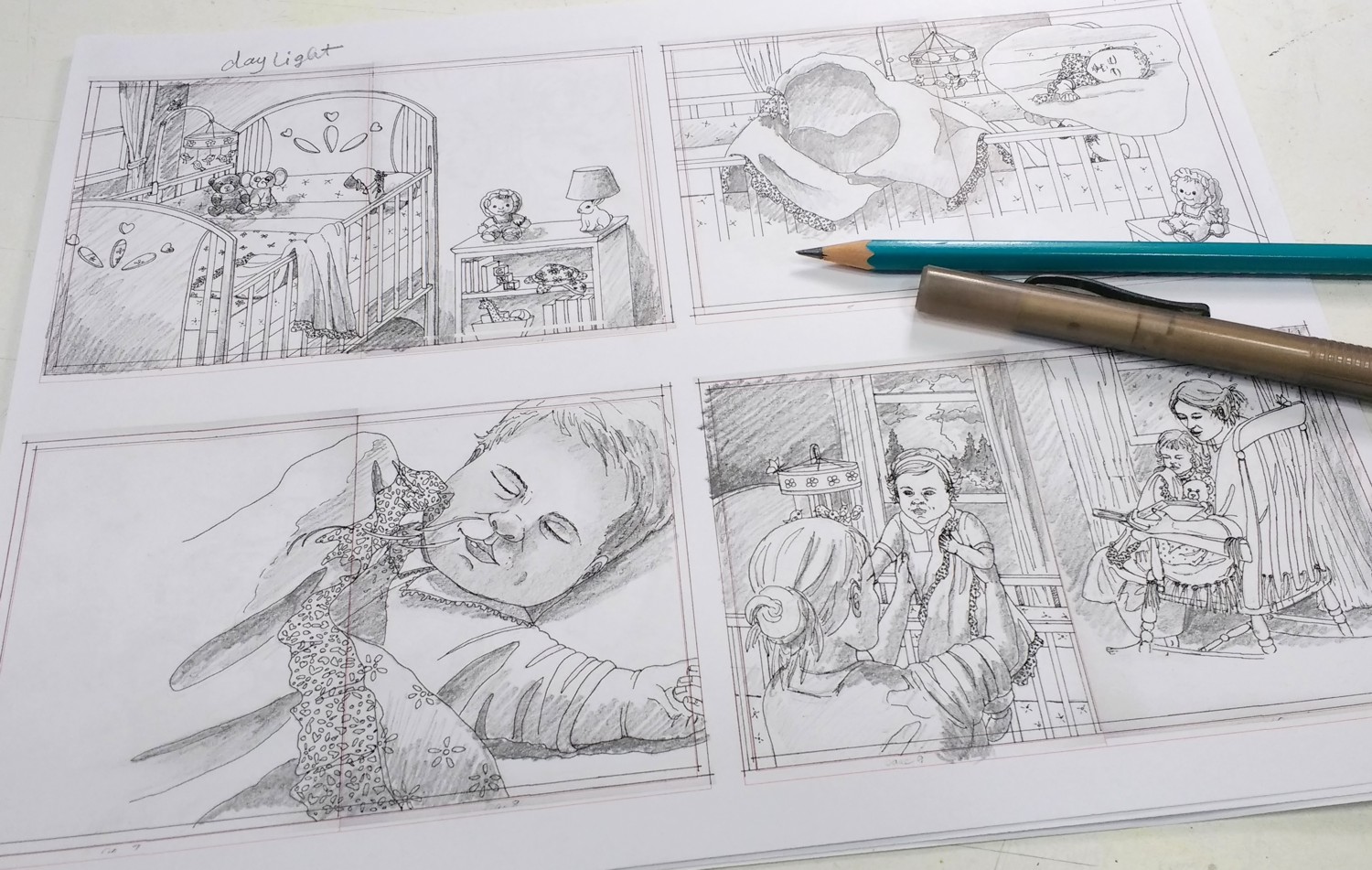
Images drawn on Borden & Riley Paper and inked

Images drawn on Borden & Riley Paper and inked

I wanted to keep the illustrations interesting, so some of the scenes are viewed from overhead or from a lower or higher perspective. After doing the initial sketches, I began drawing the images full size 9”h x 7”w for a single page or 9”h x 14” for a double spread (23 x 18 cm or 23 x 36 cm). I draw on Borden and Riley, #234 Bleed Proof Paper for pens because I like the weight of it and it doesn’t smear when I run my hand across it. After I finished the drawings and started inking them in so that the lines would be dark enough to transfer to my watercolor paper using a light table.

This is also my process when I do any of my watercolor paintings. It might take longer to create the drawing, ink it, and then transfer it, but there are several reasons why I do this.

1. I do my drawing on a separate piece of paper because I can erase and make changes before transferring it to my watercolor paper. It is better not to erase a lot on watercolor paper so that you don’t damage the surface.

2. By doing the drawing on a separate piece of paper, I can easily re-draw the image if I have an issue while creating the painting or if I want to enlarge or reduce the image before transferring to the watercolor paper I can do that.

3. Because I have drawn the image three times by the time I have transferred it to my watercolor paper , I sometimes see things I want to adjust and I am more familiar with the image prior to painting.

Small drawings printed out and shaded

Small drawings printed out and shaded

For the book, I decided to scan my inked drawings and using my Corel Draw graphics program, I reduced the drawings to fit 4 images per piece of printer paper. Then I printed them out and shaded the images to give myself information on the location of light and shadows in the scenes.

Illustrations printed on watercolor paper

Illustrations printed on watercolor paper

The next thing I did was to print some of the images onto watercolor paper using my Epson WF-4734 printer. This printer uses the Epson Durabright ink. This ink is waterproof so I can paint on top of it without it smearing. I was able to print on some 140lb, Fabriano hot press watercolor paper. It depends on your printer whether it will handle printing on this thicker paper. I then tape the watercolor paper onto some gatorfoam board.

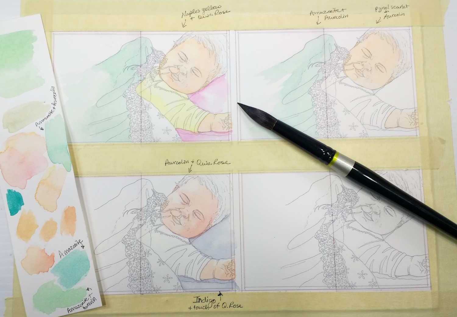
I decided to start with the baby to get an idea of the colors I wanted to use. I tried different color combinations for the babies skin and some some of the materials. The blanket will be a minty green and I decided I like a mix made with Amazonite Genuine by Daniel Smith and Aureolin Yellow to make the green. I didn’t feel the need to do all the shading and values in these color studies, because I will do that on the actual paintings.

Four versions of the baby color studies

Four versions of the baby color studies

I ended up liking the bottom left version of the baby. I am also trying to decide if I want to use the Fabriano hot-press paper or use Arches cold-press. Normally I paint on Arches 140 lb. cold press paper. I like the fact that Arches is able to handle a lot of techniques including lifting. That might come in very handy if I have to change something in one of the children’s book illustrations. Fabriano is a slightly softer paper and is brighter white. I like the look of it, but I may not be able to use some of the techniques because the surface can tear with rougher techniques. I accidentally dropped some yellow watercolor on the green blanket, but was not concerned about lifting it back off since it is just a study.

Close-up of the baby using Aureolin Yellow and Quin. Rose for pinker skin

Close-up of the baby using Aureolin Yellow and Quin. Rose for pinker skin

Right now, my lines really show. I am trying to decide if I want to use any other medium with the watercolor, like ink or watercolor pencil to give the illustrations a distinct character.

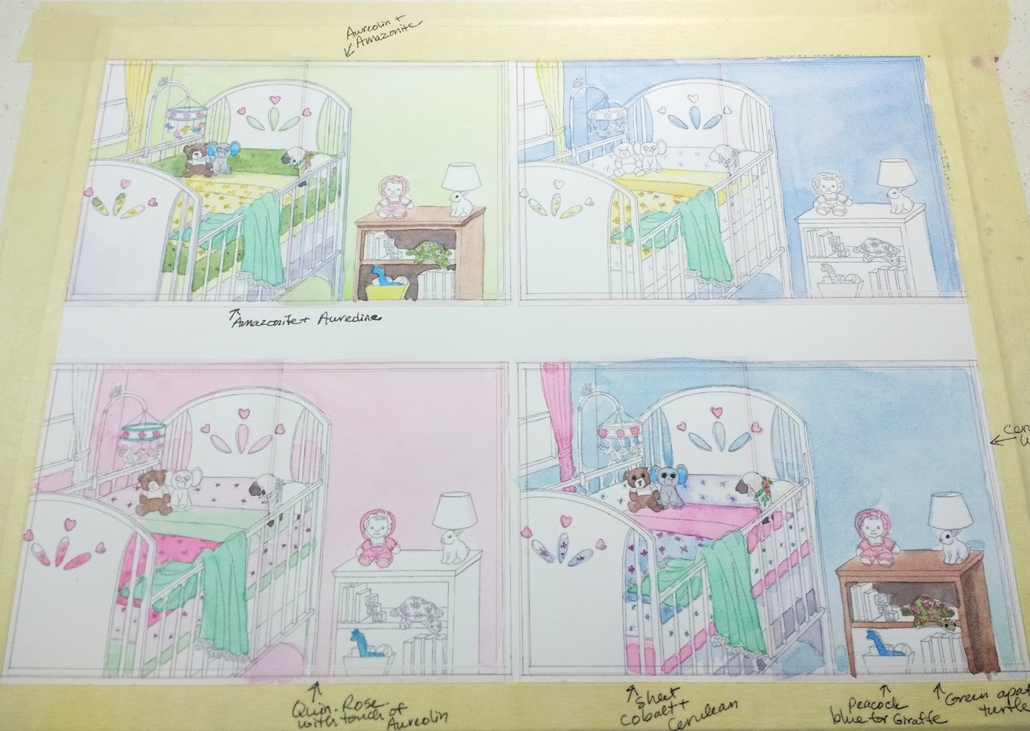
Childrens-book-illustrations-color-study-room-by-Lorraine-Watry.jpg

Next, I painted four versions of the babies bedroom to get an idea of the color scheme. I could probably do a dozen versions of the bedroom color scheme, but I ended up liking the warm look of the upper left bedroom with the yellow and green with touches of blue and pink. I explain my process for the bedroom color schemes in the video below.

I will continue to post my process and progress as I work on the illustrations for the book in the next couple of months. So, please check back.

Masking a Watercolor with Masking Tape by Lorraine Watry

Masking tape is my favorite way to mask a watercolor.

For those that are just starting out with watercolor, masking is a way to protect areas of your painting, while you paint around them. Then the mask can be removed and you can leave those areas white or you can paint them.

Click the Photo to Enlarge

There are two ways to mask a painting, masking fluid or masking tape. Masking fluid is a liquid latex substance that can be painted on your paper, canvas, Yupo, or clay board. You have to carefully apply it to get clean edges and so that it completely covers the shape you are protecting. After you are done painting around the masked area, the masking fluid is removed by rubbing it off or by using a rubber cement pick up tool. Using masking tape as a mask for watercolor is done by laying down a strip of masking tape over your shape on your watercolor paper and then carefully cutting around it to protect that shape. Masking tape works best on watercolor paper, less so on the canvas, Yupo, and clay board surfaces because the paint can seep under the tape if it is not sealed well.

There are a few of things to know if you are going to use masking tape to protect areas of your painting.

  1. Not all watercolor papers, even the professional grade papers, can handle masking tape on their surface. Some papers will tear when you are removing the masking tape. I found all pulp based papers (most are student grade) and even some cotton papers, will tear if you use masking tape on them. So, test your watercolor paper prior to using the masking tape on a painting. I use Arches, 140 lb. cold press paper and the masking tape works just fine on this paper. NOTE - If you use an Arches watercolor block, test the masking tape on a spare piece because a couple of my students had issues with their Arches paper from a block tearing. The Arches blocks may have a different amount of sizing and it may not hold up to the sticky masking tape.

  2. Make sure to use a super sticky/high adhesive masking tape because the water and paint will seep under tape that is not attached well to your paper. I use the Scotch brand masking tape #2020 from the paint department at Home Depot. It says “High Adhesion” on the inside label and pro painter on the box or shelf. You may be able to purchase this tape online if you don’t have a Home Depot near you.

  3. Use a SHARP blade to cut the tape. I know it may seem counter intuitive to use a sharp blade because you don’t want to cut through your watercolor paper, but the sharper the better. With a sharp blade you need very little pressure to cut through the tape. If your blade is dull you will press harder and can groove your paper causing the paint to make dark lines in these areas or you might press hard enough to cut through the watercolor paper. I use a snap-able, 9mm blade from Home Depot (paint dept.). This blade is inexpensive and can be refilled with new blades. When you need a new blade, you just snap off the previous blade and push up the new blade. (see image above)

  4. You can see your pencil line through the creamy colored masking tape. So, you don’t need to draw your lines extra dark. If you click on the images in this post, you should be able to see my pencil lines under the tape. There are other colors and brands of masking tape, even some with an edge sealant (like Gorilla tape). I don’t use the other colors because they can be hard or impossible to see my pencil line and I don’t want any added sealants on the tape because I don’t know what this might transfer to my watercolor paper. Those sealants might cause issues with my paint or paper down the line.

My Process for Masking this Watercolor:

For the painting in this post, I used both masking tape and masking fluid.

After drawing my image onto the watercolor paper, I stretch my paper onto my board. You can see how to stretch watercolor paper on my YouTube video at this link: How to Stretch Watercolor Paper and Transfer a Drawing

After stretching my paper, I wait until it is completely dry, sometimes I have to wait over night. You can tell if your paper is completely dry if it doesn’t feel cool to the touch. If you apply masking fluid while the paper is wet, the fluid will spread instead of staying in the shape you are masking and could adhere to the paper fibers and tear the paper when you go to remove it.

Where I Use Masking Tape or Masking Fluid on My Watercolors:

When my paper is dry it is safe to apply my masking tape and masking fluid. I use the masking fluid in small areas that might be hard to cut around if I were to use masking tape. I like using the masking tape to cover large areas, in this case the swan needed to be protected so that I didn’t get my background colors on the white bird and to make painting around the bird much easier.

Using the blade with the masking tape can be a little tricky at first, especially around curved shapes. As I said before, you need to use a sharp blade. I give the blade very little pressure as I follow my lines to cut around the shapes. I place one piece of tape at a time and cut it, then overlap the next piece of tape by about 1/8 to 1/4 of an inch. The Scotch brand tape comes in 3 sizes and I use the size that will cover the most area or that fits the shape with the least amount of waste. Some of the tape I cut off a shape is usable in another area, so I hold onto the bigger off-cuts until I know I won’t need them.

While I am cutting the tape, I found that I have to turn the paper or angle my blade a different direction to be able to see my drawing under the tape. As I have used the tape more and more, I am able to cut more precise shapes and smaller shapes. After I have cut all the tape, I go back over the tape with my fingers and press it down again to make sure that all the edges are sealed. I don’t want any paint seeping under the tape. I don’t leave the tape on the paper for very long. I think the longest I’ve left it was a month and that is pushing it because the glue that is on the tape can start transferring to your paper and causes a sticky mess.

The Reason I like Masking Tape Over Masking Fluid:

I used masking fluid only for many years. However, now my favorite way to mask a watercolor is to use masking tape.

Masking fluid takes longer to apply and if I was not careful, I would end up with messy edges or openings in the mask that I got paint on. Shapes that were protected with masking fluid usually need some clean up after I remove the mask because the shapes usually aren’t exactly as I want them and they look rough and out of place with the rest of the painting. So, I would have to go in with paint to clean up the edges or a scrubber to soften and change the look of the shape.

Masking tape will give me a very clean edge (as long as I cut carefully) that doesn’t need any clean up when I remove it. As long as I use “High Adhesion” masking tape there shouldn’t be any paint on my shapes when I remove the tape.

See this Full Watercolor Demo in a Future Magazine Article:

This painting will be published in an article that I am doing for International Artist Magazine. This is only a portion of the full painting. The article will include a step-by-step demonstration of the complete painting.There is no date yet for the article, but if you sign up for my newsletter, I will announce when the article is available in the Magazine.

How to Mix Vibrant Colors in Watercolor by Lorraine Watry

There is a lot to color theory and it can’t all be covered simply or quickly. This post is to give you some generalities to work with when making watercolor mixes and how to mix Vibrant Colors and not Muddy Colors.

When trying to make “Vibrant” color mixes try these tips:

1. The brand and quality of paint you use can and does make a difference on how vibrant your color looks. If you use a student grade paint, it will have chalky fillers in it to make it less expensive. The paint will not be as vibrant. Some brands of professional or artist grade paints are not as vibrant as others. It can depend on how much pigment they use in the mix and what kind of binder they use. I have switched to Daniel Smith Watercolor for almost every color on my palette because of how vibrant their colors are and how easy it is to re-wet the paint and load up my brush. (Paints that have the following labels are student grade: Cotman, Van Gogh, Academy, Akademie, Prang, Reeves)

2. Mixing too many colors together can lead to a dull or “muddy” color. Generally a mix of 3 pigments is safe, but when you make a mix of 4 or more pigments it brings in too many different color factors that can cause the mix to look muddy.

3. Using colors that only have one pigment in the paint instead of 2 or 3 can help you achieve brighter or more vibrant color mixes. An example - Cobalt is made of one pigment - PB 28*, while Permanent Alizeran Crimson Hue has 3 pigments - PR 177, PV19, PR 149 (*see note below for info on pigments). So, if I make a mix with Cobalt and Perm. Alizeran Crimson, I am actually mixing 4 different pigments, not just 2. Then if I decide to add another color to the mix, I now have at least 5 pigments involved. (*Pigments are designated with letters and numbers. The ‘P’ is always used to indicate pigment, then the other letters indicate the family the pigment comes from. So, ‘R’ is red, “B” is blue, ‘Y’ is yellow, ‘V’ is violet, ‘O’ is orange, ‘G’ is green, ‘Br’ is brown, ‘W’ is white, and ‘Bk’ is black. The official definition of the number part of the name is - generic index number that identifies it chemically, regardless of proprietary and historic names.)

color-theory-example-color-chart-Daniel-Smith.jpg

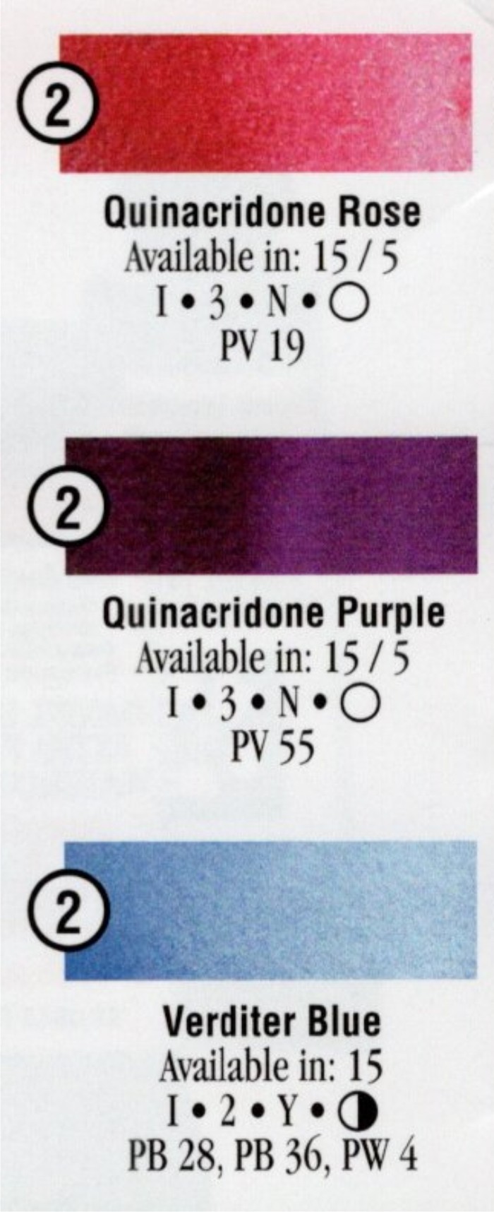
Some brands of watercolor will have the pigments in each paint listed on the tube or on a color chart for that brand. (I only have a few paints on my palette now that have more than one pigment in them.)

There are other properties like staining vs non-staining, granular vs non-granular, etc. for each pigment. The color charts usually have a key that tells you how to read the information. These properties don’t necessarily affect how vibrant a pigment or mix will be, but it is good information to know.

Example color chart info from Daniel Smith. (you can find some color charts online by Googling “paint brand and watercolor chart):

4. When you are brushing the paint onto your paper, the less brushing back and forth you do, the better. When applying the paint, I try to skim it across the surface and leave it. Brushing back and forth a lot in an area can cause the paint to be duller. Also, it can mar the surface of the paper, causing it to look dull. If you want to add color, or adjust an area, it is usually better to let it dry and come back later with another layer.

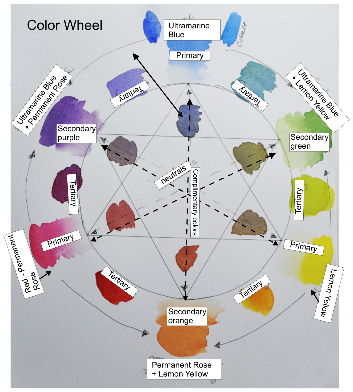
5. To darken a color and keep it vibrant, start by using a color in the same color family. For instance to darken a green add a darker green to the 1st paint. If that is still not dark enough then use a paint from a family that is next to green - which would be blue.

Example Color Wheel. There are many other options to create a color wheel.

Example Color Wheel. There are many other options to create a color wheel.

6. When mixing colors - always think of the color wheel. The primaries are yellow, red, & blue. The secondaries are orange, green, & purple. Tertiary colors are mixes made from a primary color and a secondary color. When you mix colors across the color wheel you are mixing complimentary colors and these mixes will be more neutral or ‘grayed down’. Complimentary colors are: blue and orange, green and red, and yellow and purple.

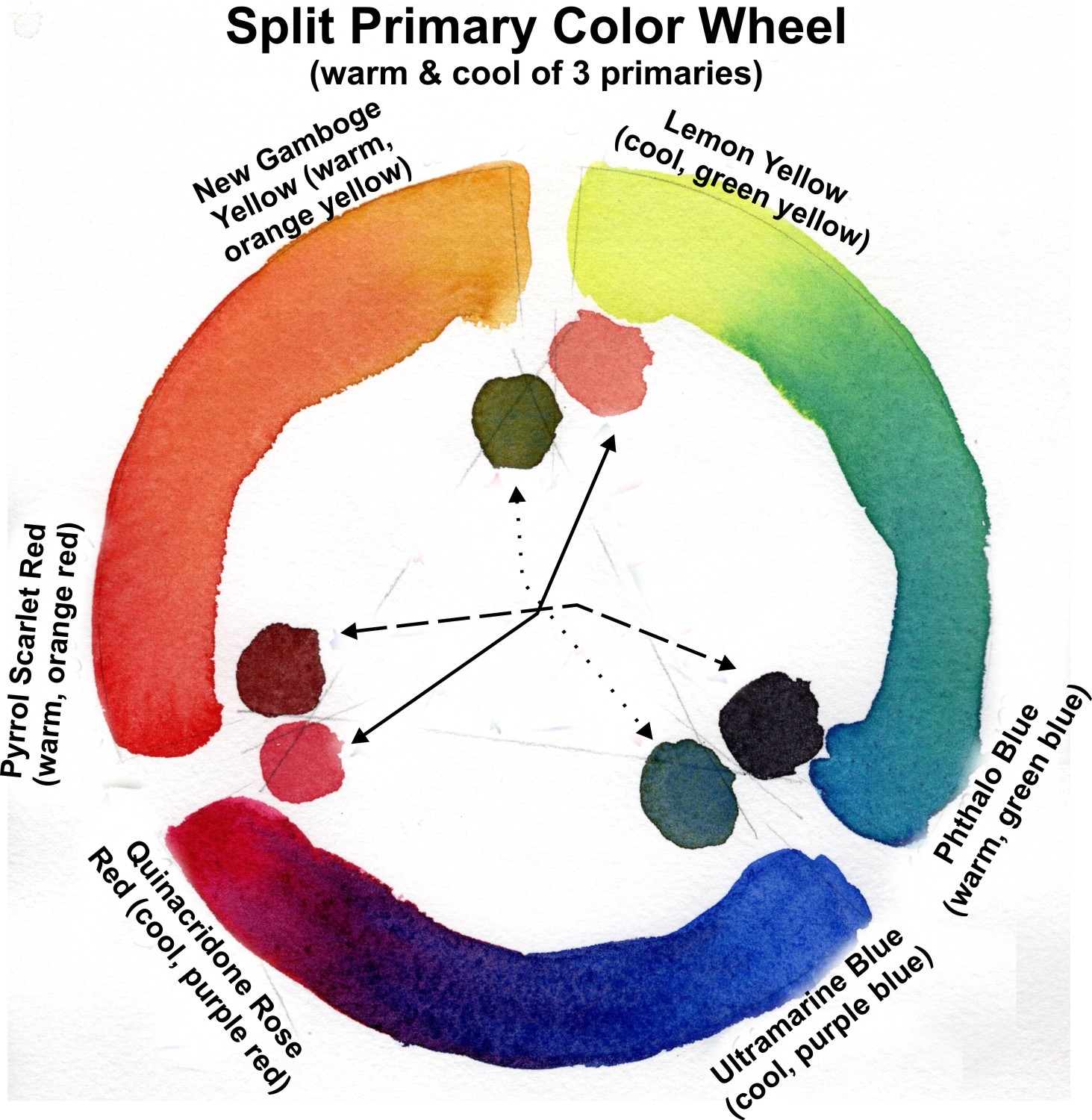
mixing-vibrant-colors-split-primary-color-wheel-Lorraine-watry.jpg

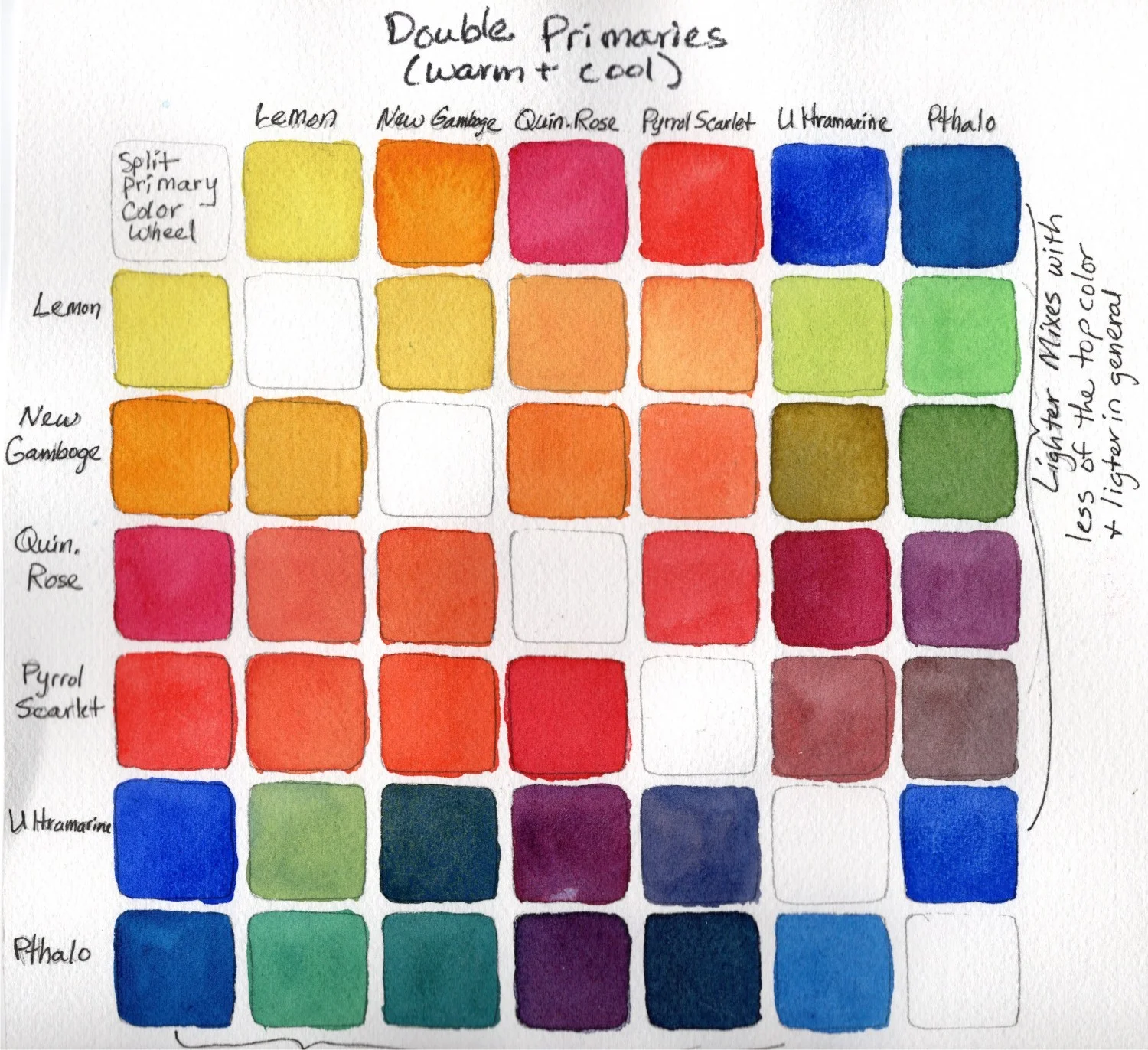
7. Color families are red, yellow, blue, green, orange, and purple. Each of these color families have colors that are cooler and warmer. Ex. in the red color family, Quinacridone Rose is a cooler red than Cadmium Red. So, if I mix a warmer red (leans toward orange) with a blue, the resulting purple mix will not be as vibrant because the warm red and blue are almost complimentary colors. Mixing two primaries that lean toward the same secondary will more likely create a vibrant mix. Ex. Lemon Yellow & Phthalo blue both lean toward green.

mixing-vibrant-colors-Example-color-mixing-chart-Lorraine-Watry

When trying to make a vibrant mix think about the above factors. If the color you get from the mix does not look very bright or vibrant, then you may need to investigate and make an adjustment in the pigments you are using to make the mix.

Hint: taking the time to make a color chart of the colors you are thinking of using in a painting can help you understand what kind of mixes you will get - Vibrant or Neutral.

For more Color Theory information check out this post “Understanding Color Theory” - Design Wizard

Not All Watercolor Paper Is Created Equal

As a watercolor instructor I ask my students to purchase the professional grade watercolor paper rather than student grade because the surface can really make a difference when painting with watercolor.

Professional grade watercolor papers are made with 100% cotton fibers as compared to student grade papers that are often made with wood pulp or a blend of synthetic and wood pulp fibers. Professional, 100 % cotton papers are acid free and free from impurities that can damage the paper over time. Wood pulp papers do not have all of the acidity removed and contain natural impurities that can cause the paper to yellow, age, and break down over time.

Double-Primaries-chart-watercolor-by-Lorraine-Watry.jpg

Yes, student grade watercolor paper can cost less and there is a perception that they are just students, so they don’t need to spend more and get the professional paper. Even if the student doesn’t care if their early works survive, the problem with the student grade paper is that it doesn’t work the same way with watercolor as the professional paper does. Therefore, the money they put out for the student grade paper is a waste because they are not going to have a good experience when trying to learn watercolor techniques.

One of the issues I have noticed is that student grade paper can dry faster. So, when I show them how to do a smooth glaze on my professional grade paper and they try to replicate it on student grade paper, they often end up with the brush strokes drying too quickly and that will leave lines and banding.

Another issue is that there is a different amount of sizing in student grade paper that can lead to the watercolor behaving poorly. The professional grade papers have sizing and different brands use different amounts and kinds of sizing. With the student grade, wood pulp paper, the sizing is often over-done leading to the paper resisting the paint, the paint will bead up and run off, or if there is too little sizing the paper will be too absorbent and the color will look bland.

I have also noticed that the student grade paper tends to lead to more blooms and muddy colors. If the student is not seeing the same effect on their paper, so they tend to over work it by going back into the same area multiple times and this can cause blooms, muddy colors, or marred paper.

This brings me to my final point, the wood pulp paper can not handle the same techniques that most professional watercolor papers can. I use masking tape and masking fluid on my Arches - 100% cotton paper. However, these techniques do not work on the student grade, wood pulp papers. The masking tape and masking fluid will tear the surface upon removal. I also use a flat brush to lift color off of my paper and this technique can often scratch or tear the surface of the wood pulp paper. There are some professional grade papers that don’t handle these techniques as well as the Arches brand.

If you are new to watercolor, I would suggest buying the “Professional Grade” 100% cotton watercolor paper over the student grade, wood pulp paper. The process of learning watercolor can already be a bit daunting without adding another issue into the mix. A sheet of 22” x 30” watercolor paper can be torn up into smaller pieces and both the front and back of the paper can be used. So, if you are trying techniques, color mixing, or doing a painting, the backside is still usable because the paint will not seep through to the opposite side.

Technical information about watercolor paper:

  • Good “Professional” brand papers are: Arches, Fabriano, Jack Richeson, Kilimanjaro, Lanaquarelle, Saunders Waterford, Twinrocker, and more. (if you really want to learn about the technical aspects of these papers, look at www.handprint.com/HP/WCL/paper2.html. My favorite paper right now is Arches, but I also like Fabriano. Arches handles a lot of abuse, taping, masking, and scrubbing without issue.

  • Watercolor paper comes in standard weights: 90lb., 140lb., and 300lb. There are a couple of brands that have weights in between these or heavier. The weight refers to a ream (500 sheets) of 22”x30” paper. For example, a ream of 140lb. paper weighs 140lbs (US) or 300gsm (European). The weight I use most is 140lbs. I stretch my 140lb paper so that it doesn’t buckle when I am painting on it. (see my “How to Stretch Watercolor Paper” on Youtube). There is a little difference in how much the paint is absorbed between the different weights. Try them out to find the one you like best.

  • Three standard surfaces of watercolor paper - Hot Press, Cold Press, and Rough. Hot press is paper that has been pressed with heat to give the paper a smooth surface. Cold Press (or NOT “Hot Press” in Europe) is paper that has some texture. Rough is paper that has the most texture. I use Cold Press paper the most because it is sort of a middle of the road paper that can handle a lot of different watercolor techniques. I use Hot Press for ink and watercolor because the smooth surface works well with ink pens.